Avondale Type Company
Artist Series
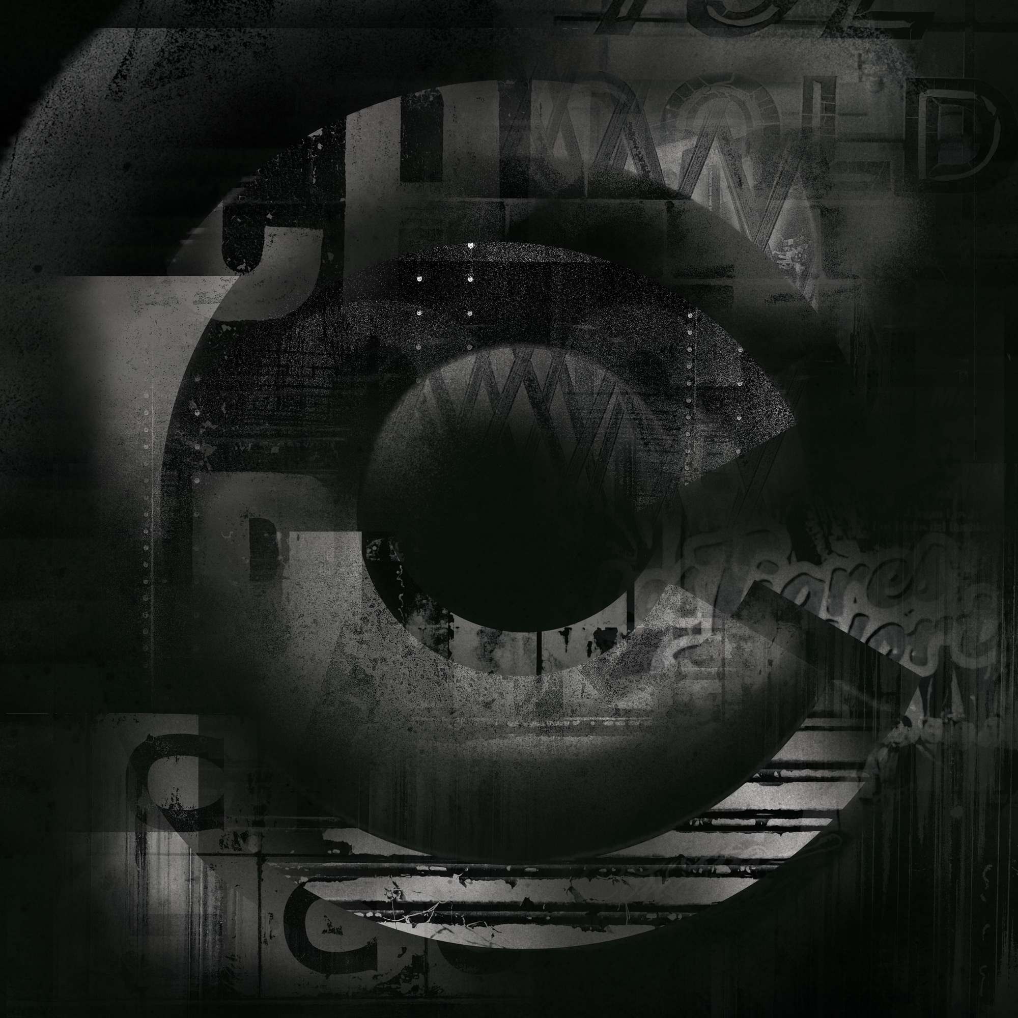
In Spring 2018, Chicago-based type foundry Avondale Type Co. launched its annual Artist Series—a global collaboration that invites creatives to reinterpret three letters, one symbol, and the ATC logo through their own unique lens. Anchored in the ATC Duel typeface, the series explores the intersection of typography, texture photography, and collage-style cubism. Each contribution becomes a visual conversation between structure and spontaneity, celebrating the versatility of type as both form and expression.

The Design
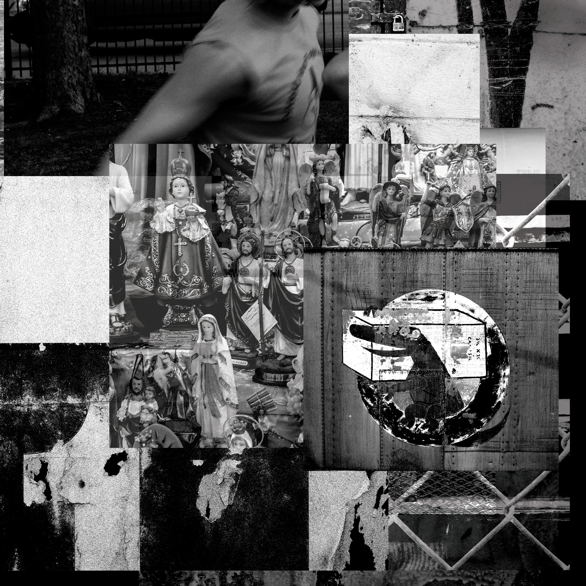
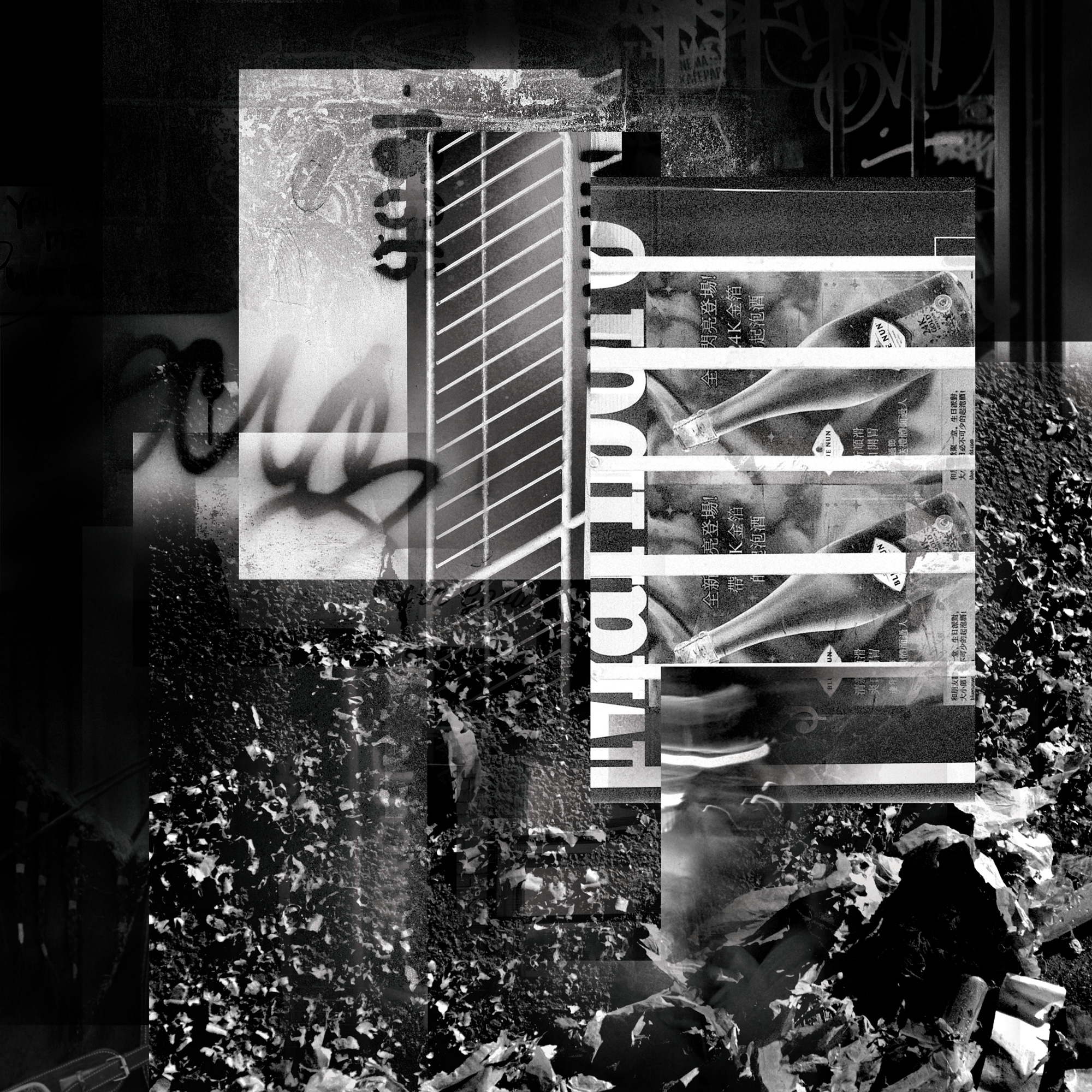
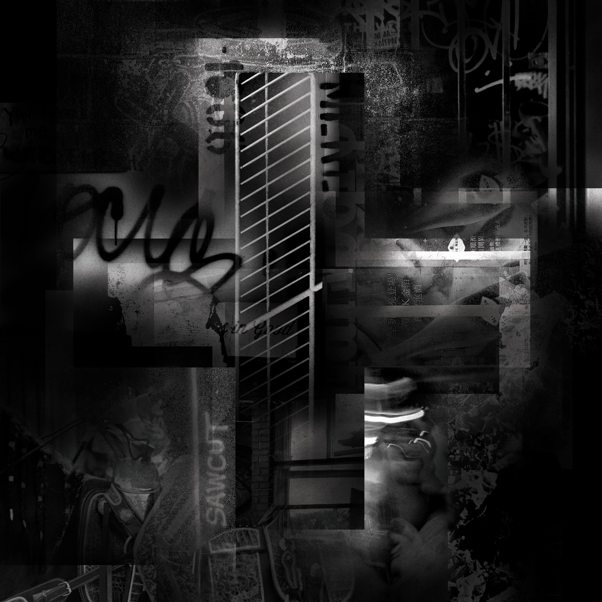
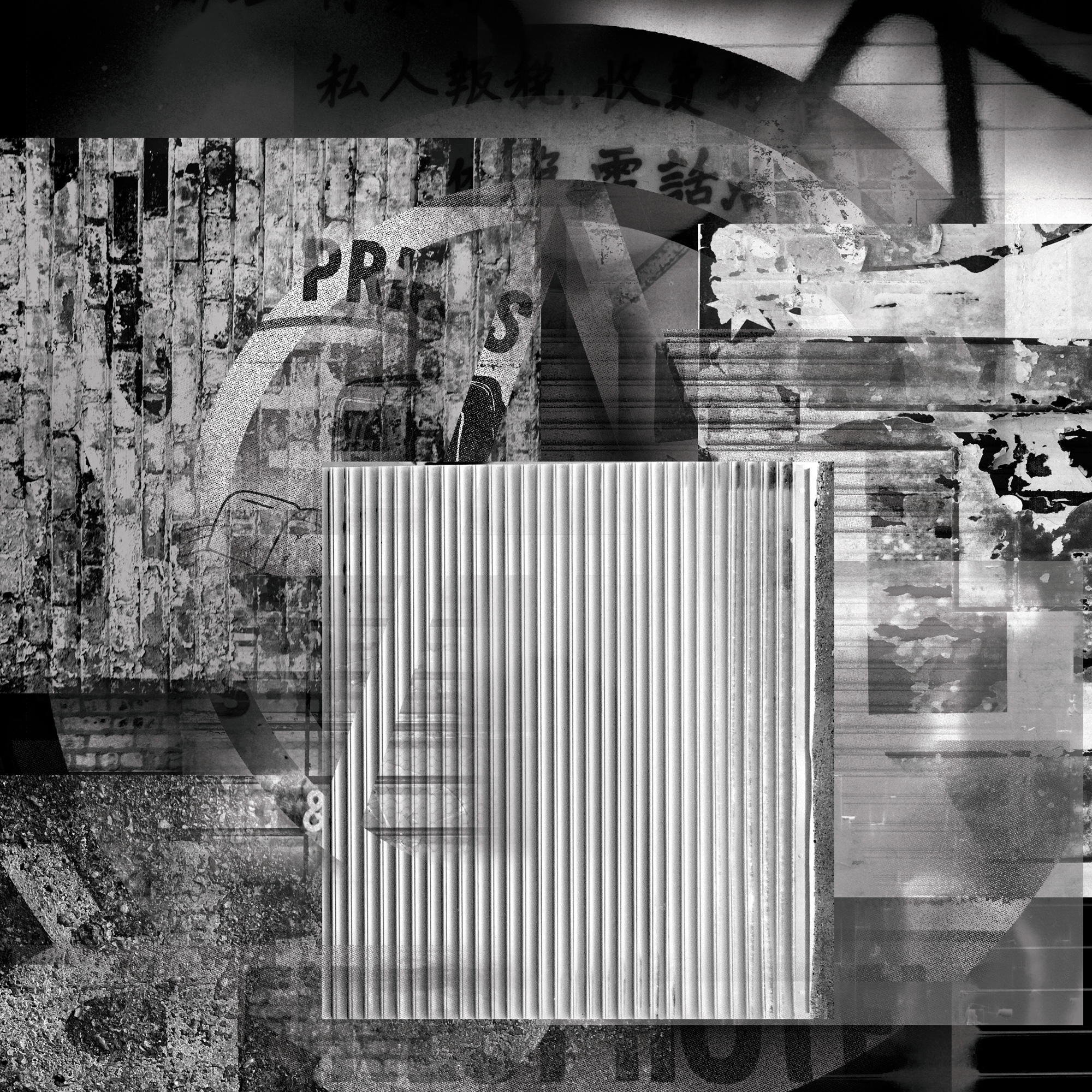
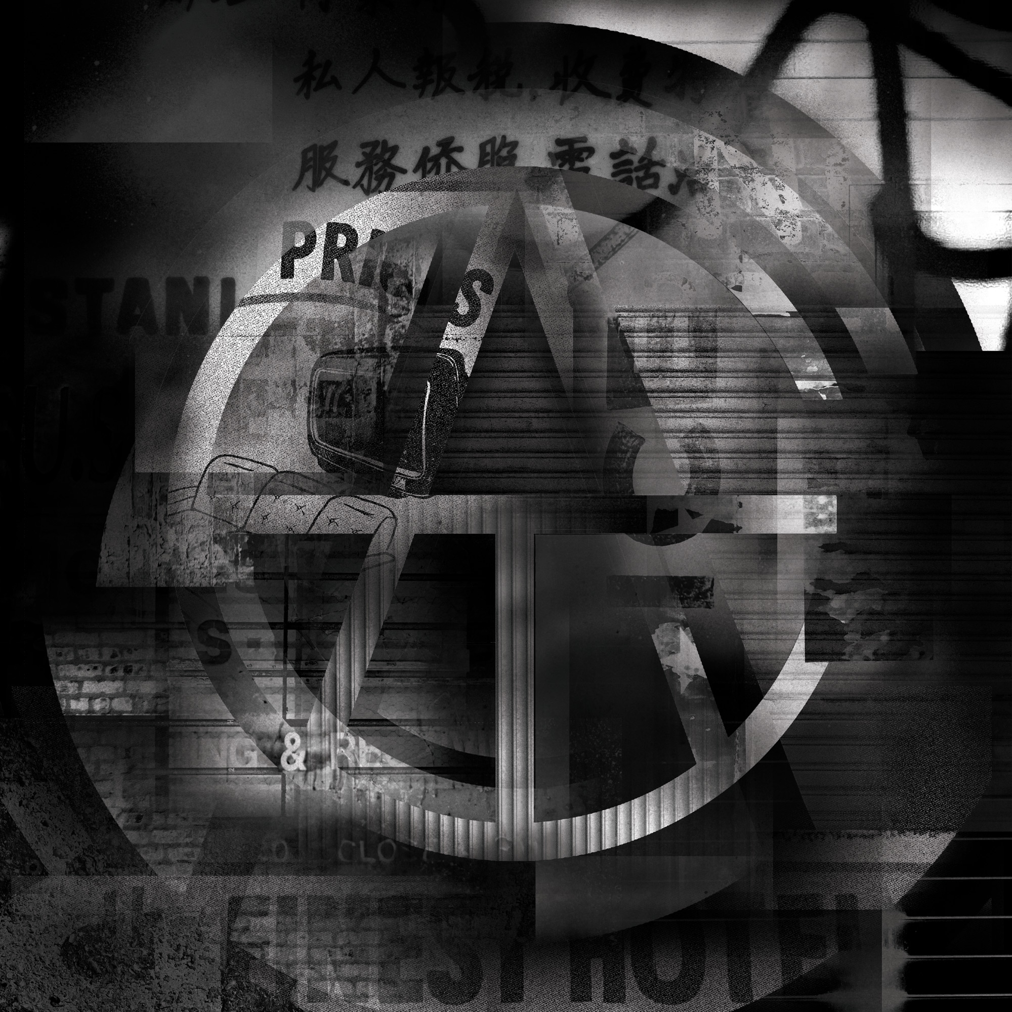
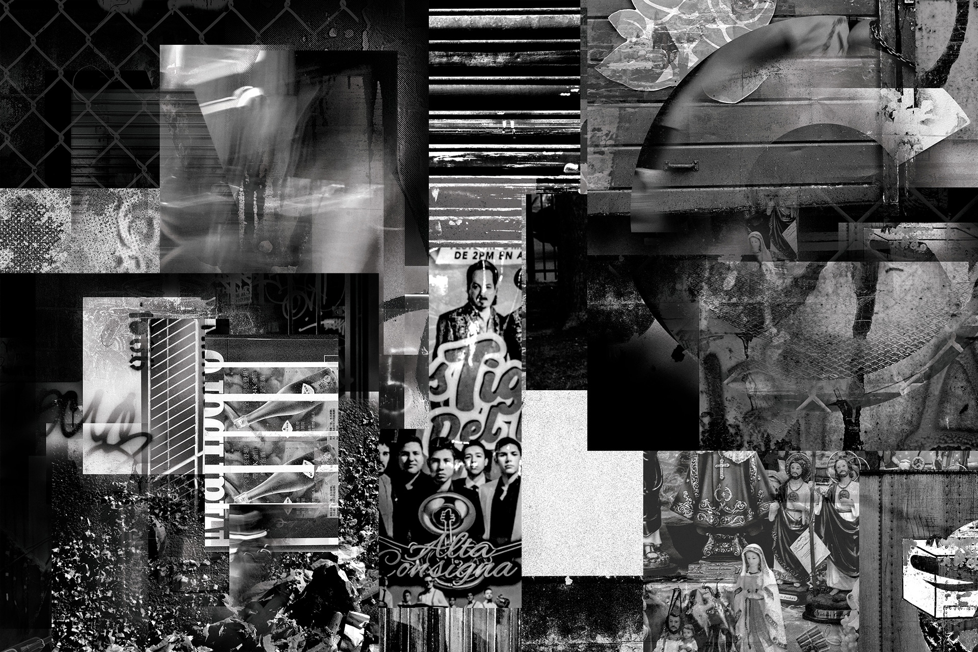
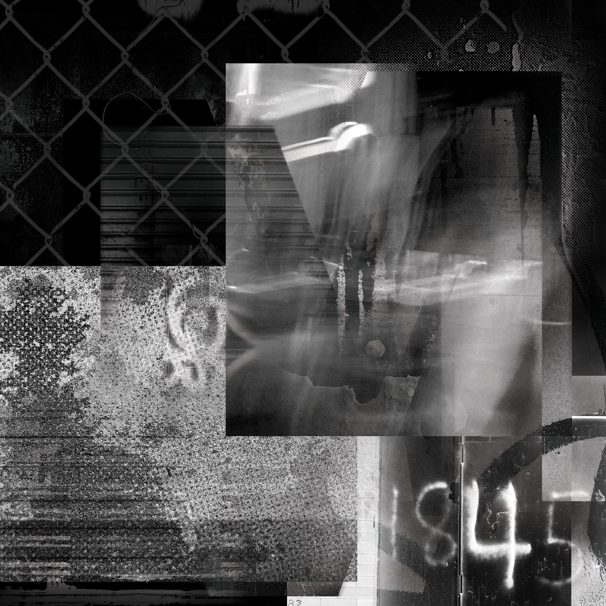
Each letter in the series carries a distinct visual identity, shaped by the nuances of its individual form. The interplay of textures and their layered blending offers a fresh perspective on how materiality and typography can inform one another. Initial compositions present the unmasked texture arrangements—allowing the raw visual elements to stand on their own before being integrated into the letterforms—highlighting the process of transformation from abstract texture to typographic expression.
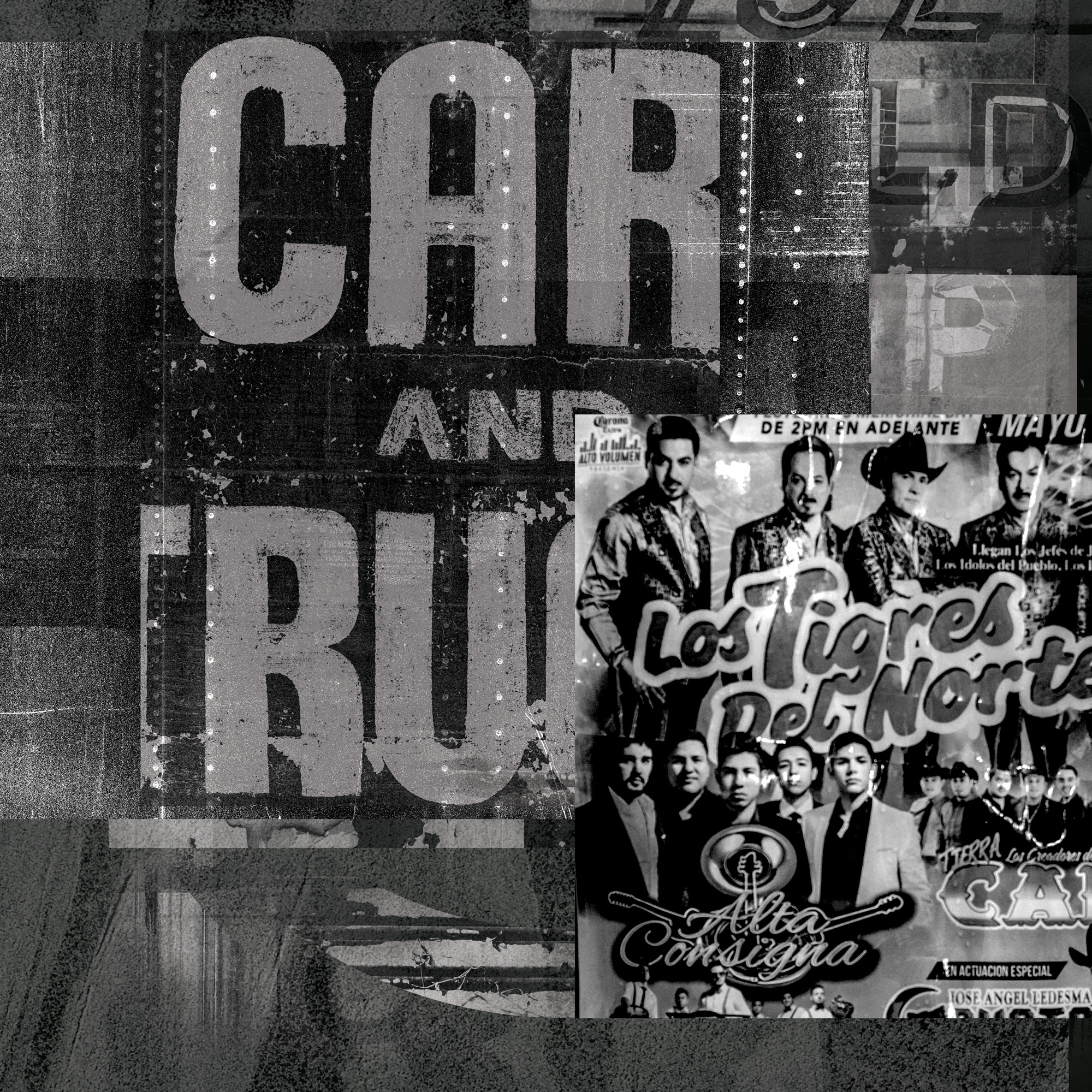
All texture imagery was captured using both digital and film cameras, collected over time throughout the city of Chicago. These visual fragments serve as a personal archive—documenting the urban textures that shape the visual DNA of the series.