BLACK SHEEP FARMS BRAND IDENTITY
Black Sheep Farms (BSF) is a hydroponic farm based in Fort Meade, Florida, focusing on leafy greens and head lettuce. They’re one of 1.4% Minority Farms in the US that serves many clients, including public school systems, hospitals, and athletes from collegiate to professional levels.
Black Sheep Farm’s fully vertical business model, means the company handles every step of the process—from growing and harvesting to packaging and delivering its produce. The company’s mission extends beyond agriculture, with a clear goal of combating modern food deserts, starting in Polk and Highlands Counties and expanding beyond.
Creative Scope: Identity, Campaign work
Year: 2024-2025
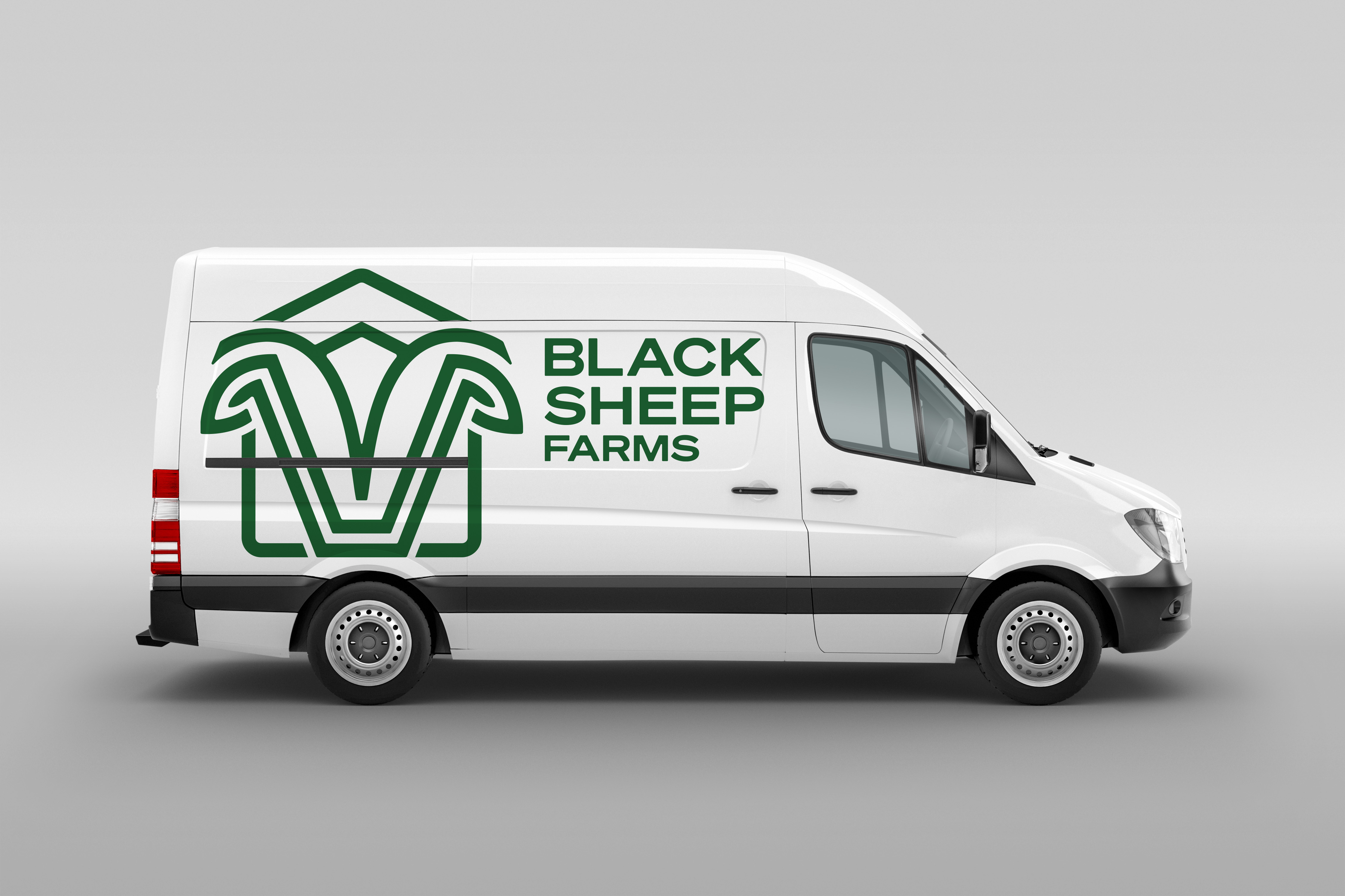
Logo Design
The Black Sheep Farms logo is composed of two primary elements: the logomark and the wordmark. Together, these elements create a logo that reflects the core values of agriculture, innovation, and community that define Black Sheep Farms. The use of organic shapes and natural elements conveys a sense of trust and sustainability.
The green house shape symbolizes its Black Sheep Farm’s strong ties to agricultural roots. The inside mark resembles a sheep outline while also referring to a hole for the start of new growth. With ears that reference leaves to further emphasize the connection to nature. The upper lines emphasize the sheep’s horns while also including an arrow pointing upward to symbolize prosperity and new growth.


Branding Elements
Alongside the logo development, multiple mockups were created to align with practical usage and business needs. These mockups fall within the scope of Black Sheep Farms’ operations, showcasing the versatility and effectiveness of the brand mark.


Secondary Marks
Additional logos were created to serve as secondary marks. These designs combine the wordmark and logomark while incorporating elements significant to the brand’s history. Potential uses for these marks include t-shirt designs, packaging stamps, social media, and more.
