FAST TWITCH
ENERGY DRINK
Gatorade’s innovation extends far beyond hydration. With the launch of Fast Twitch—a new energy drink named after the high-performance muscle fibers responsible for explosive movement—the brand stepped into a bold new space. Engineered for intensity, Fast Twitch was designed to energize athletes before the first whistle, bridging science and sport in a way only Gatorade can.
The challenge: how do we translate this kinetic energy into a brand experience that resonates at retail, inspires on the field, and connects with consumers? The answer required a cohesive, multi-channel approach that infused the product’s explosive spirit into every touchpoint—from packaging and in-store presence to digital storytelling and athlete engagement.
The challenge: how do we translate this kinetic energy into a brand experience that resonates at retail, inspires on the field, and connects with consumers? The answer required a cohesive, multi-channel approach that infused the product’s explosive spirit into every touchpoint—from packaging and in-store presence to digital storytelling and athlete engagement.
Creative Scope: Identity, Packaging, Digital Assets, Environmental Graphics, Signage,
Year: 2022-2024
Design Direction: Lauren Versino
Year: 2022-2024
Design Direction: Lauren Versino

Brand Ideation
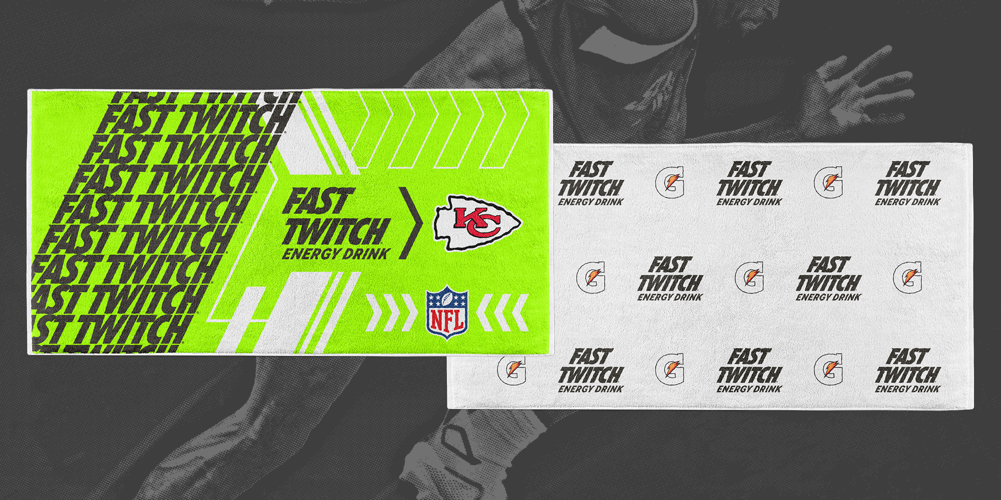
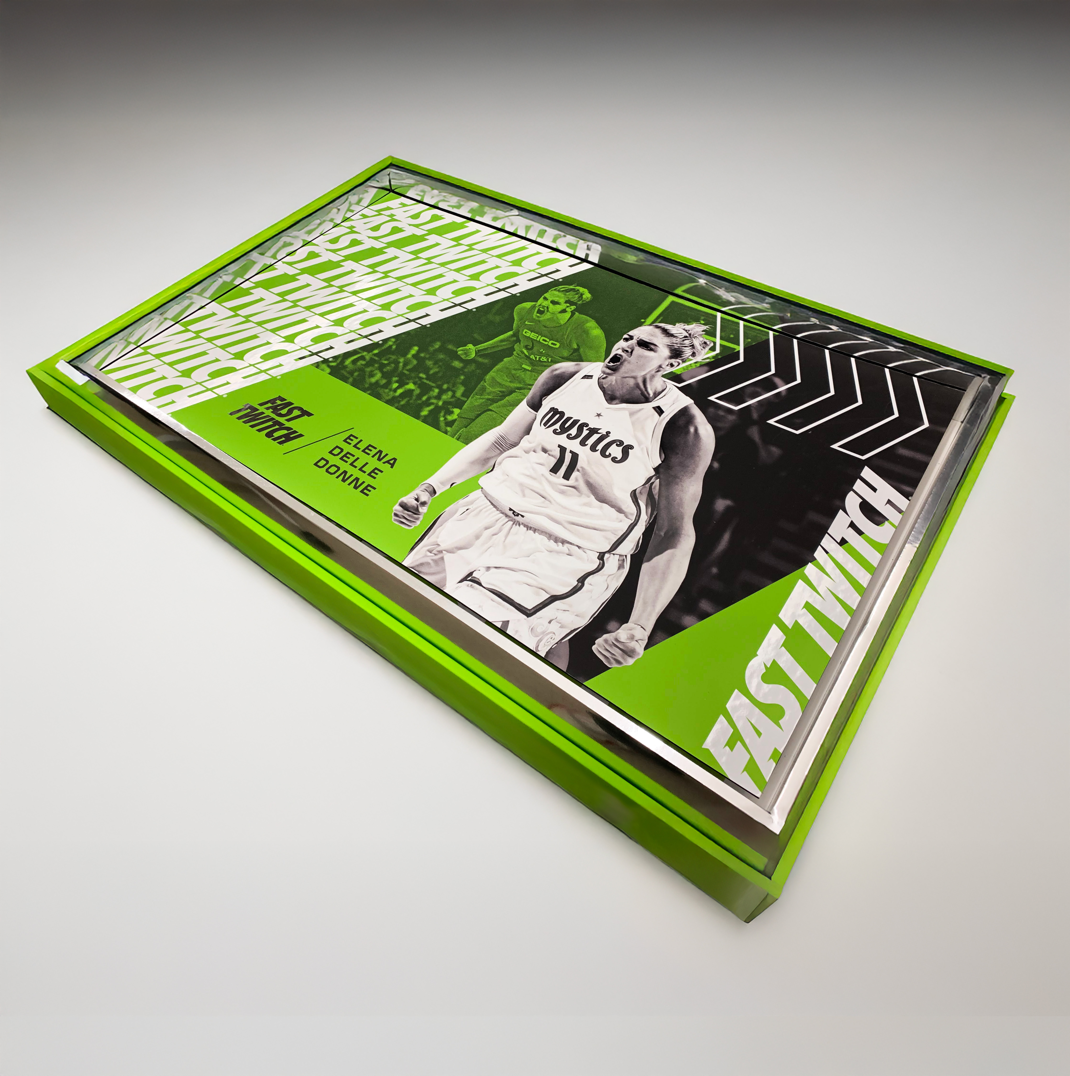
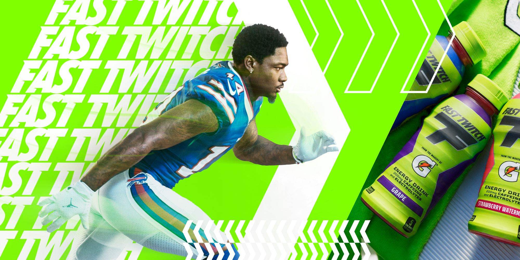
Our approach began at the point-of-sale, where visual impact is critical. At the core of the identity was Fast Twitch Energy Green—a vibrant, high-voltage hue crafted to command attention both in-store and on the field. Supporting graphic elements such as chevrons and directional arrows were integrated throughout the system to evoke speed, motion, and forward momentum—core attributes of the product itself.
A carefully considered color hierarchy played a key role across retail, print, and digital touchpoints. Initially, white functioned as the primary backdrop, accented by Fast Twitch Green and charcoal. However, through iterative design exploration, we discovered that inverting this hierarchy—elevating green and charcoal to dominate—better conveyed the brand’s bold energy and allowed the visual system to truly reflect the product’s high-intensity spirit across all mediums.
Visual System
This visual system was tested and applied across both vertical and horizontal formats, proving its adaptability across a wide range of mediums—from in-store point-of-sale displays to digital executions. To ensure brand consistency and visual cohesion, key layout elements were standardized across all applications. The headline, always set in Fast Twitch Green, remained the most dominant element and was consistently positioned in the top-left corner to anchor the composition. The product lockup—featuring the bottle—was centrally placed within a structured zone of Fast Twitch Green and white, creating a recognizable focal point that reinforced the brand's energy and visual identity across all touchpoints.

Visual System
To maintain visual clarity and flexibility across formats, the reason-to-believe messaging was strategically positioned based on orientation—appearing at the bottom in horizontal layouts and at the top in vertical executions. This adaptive placement preserved a consistent hierarchy and reinforced brand storytelling, while allowing each layout to function optimally within its format. The result: a cohesive system that balanced structure with adaptability across all design assets.

Brand Assets
Another key challenge was translating the established visual language into physical and environmental applications. While the in-store assets had a defined look and feel, bringing the brand to life in a larger, more immersive context required a bolder, more expressive approach. This opened the door to expanding the visual toolkit—leveraging chevrons, directional arrows, repeating logo patterns, and high-impact photography to amplify energy and movement. The result was a dynamic and cohesive brand presence that extended beyond retail, capturing the intensity and momentum of Fast Twitch in every physical touchpoint.