Gatorade
G-Fit Campaign
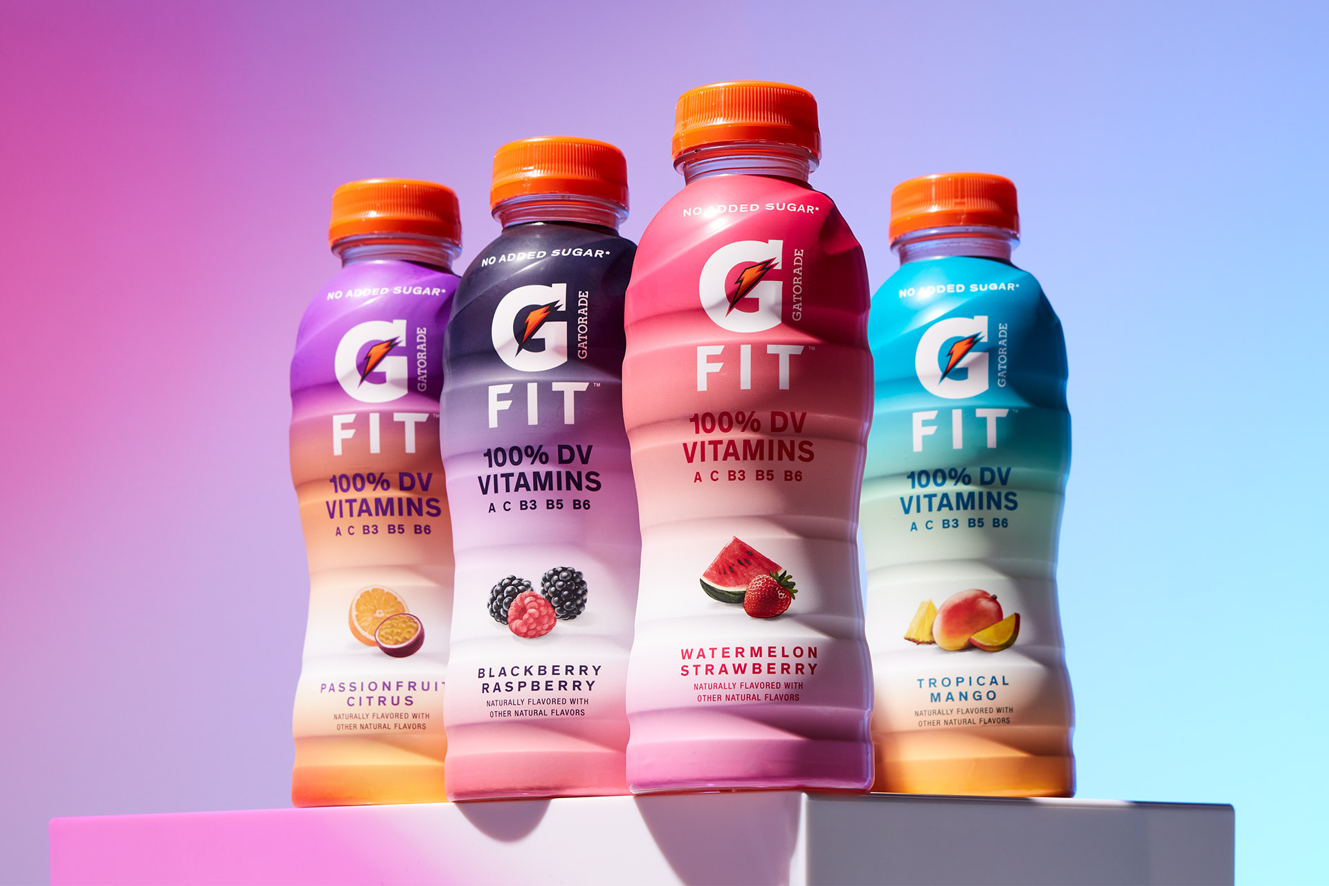
G-Fit by Gatorade is a lower-calorie hydration option with no added sugars, fortified with essential vitamins to support active lifestyles. With the recent launch of its packaging redesign, the brand introduced a vibrant system of color gradients—each shifting to reflect the unique flavor within, creating a more dynamic and modern shelf presence.
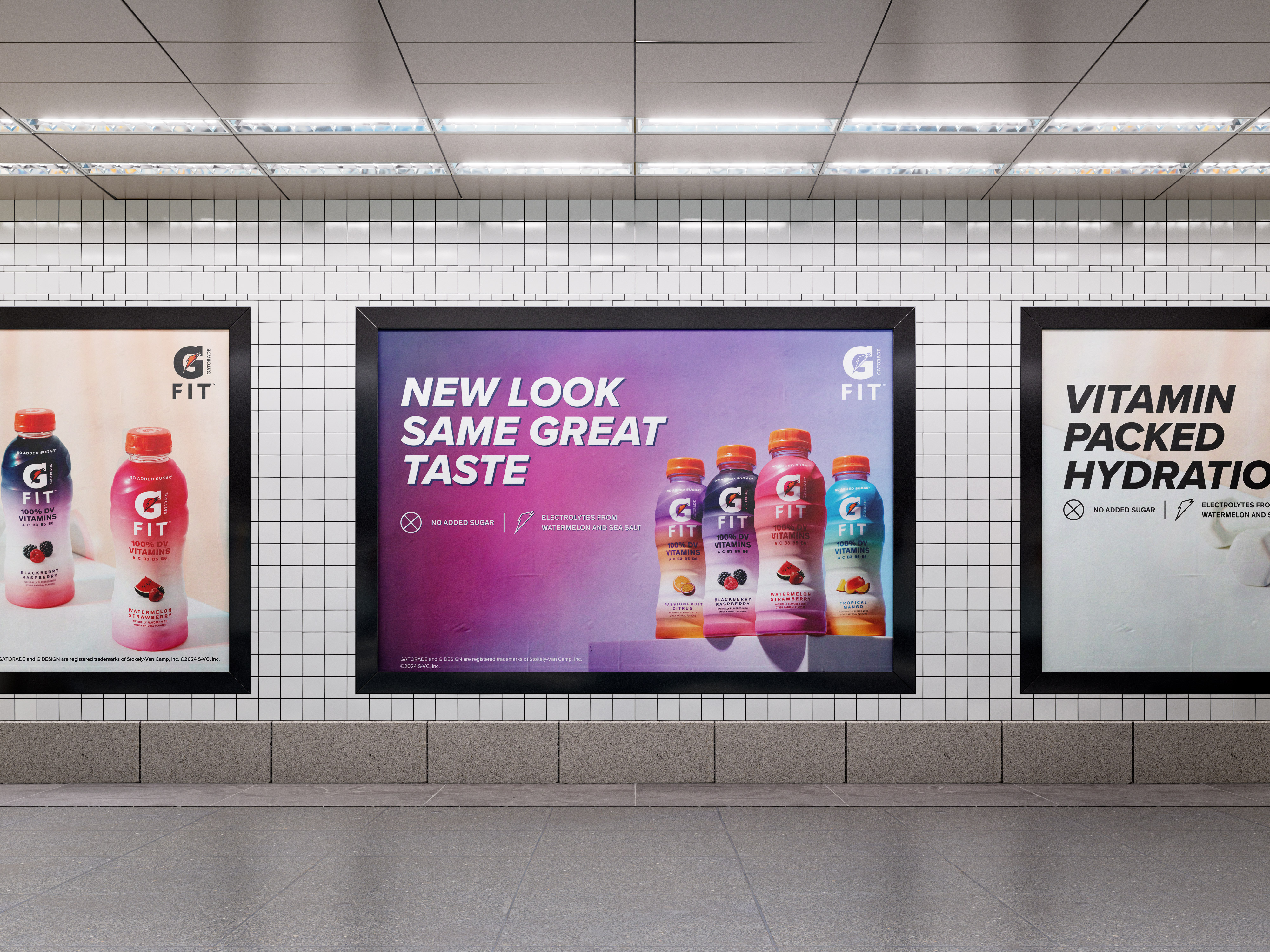
To support this update, a refreshed creative approach was needed to reintroduce G-Fit to consumers. This included a holistic rollout of point-of-sale materials and a new photography direction that balanced clarity, energy, and taste appeal.
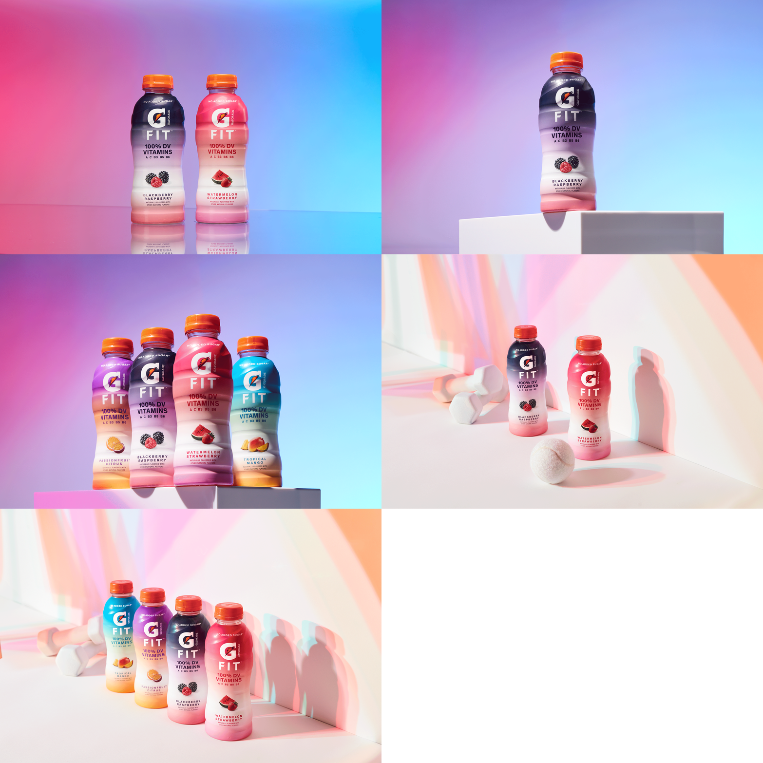
Photography was captured both in-studio and on-location. Studio beauty shots focused on showcasing the new bottle design, with lighting and backgrounds that echoed the subtle gradients of each flavor. On-location imagery featured models engaging with the product in active settings, drawing inspiration from contemporary product photography trends to connect visually with G-Fit’s health-conscious, on-the-go audience.
Creative Scope: Print, Photography Concepting, Art Direction, Design
Design Direction: Tony Vitali
Photography ︎︎︎ Bracket Studios


The Look
The point-of-sale system was intentionally designed to let the product take center stage—allowing the new bottle design to stand out as the hero—while offering flexible space for headlines and key brand elements. Photography was art-directed with versatility in mind, tailored for multiple formats and platforms. Central to this was platform photography, which emphasized the bottle through the use of soft shadows and gradient lighting, creating a sense of energy and depth.
In-studio shoots captured a variety of product scenarios guided by a refined photography playbook. The visual language leaned into G-Fit’s positioning within the health and wellness space—featuring monochromatic weights, tonal wall textures, and subtle accents of Gatorade orange. This minimalist yet purposeful backdrop allowed the vibrant flavor gradients of the bottle to shine, reinforcing the updated visual identity.
Consumer testing revealed the need to address two core messaging pillars: the new visual look and the product’s health-forward benefits. In response, two complementary headline systems were developed—one focusing on the packaging refresh, the other highlighting G-Fit’s nutritional advantages. Together, they formed a flexible toolkit designed to connect with a range of consumer motivations.


