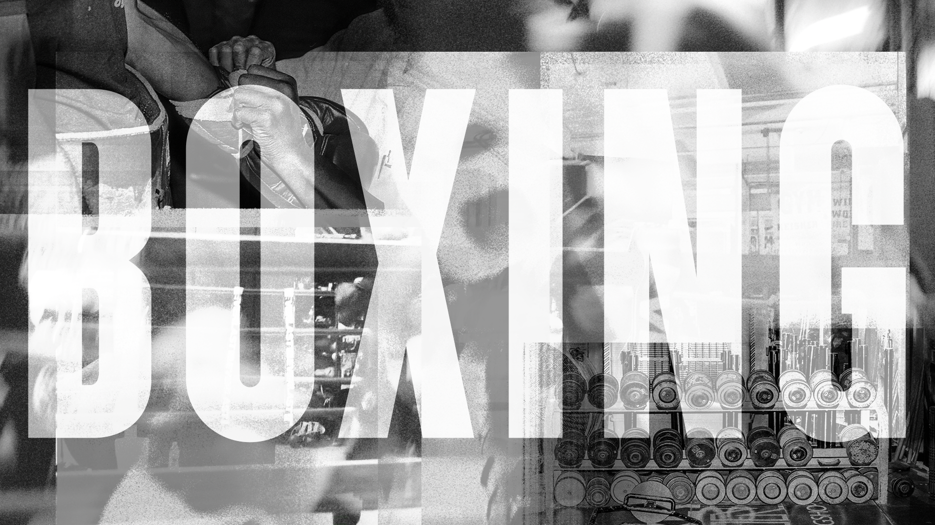
Gleason’s
Boxing Gym
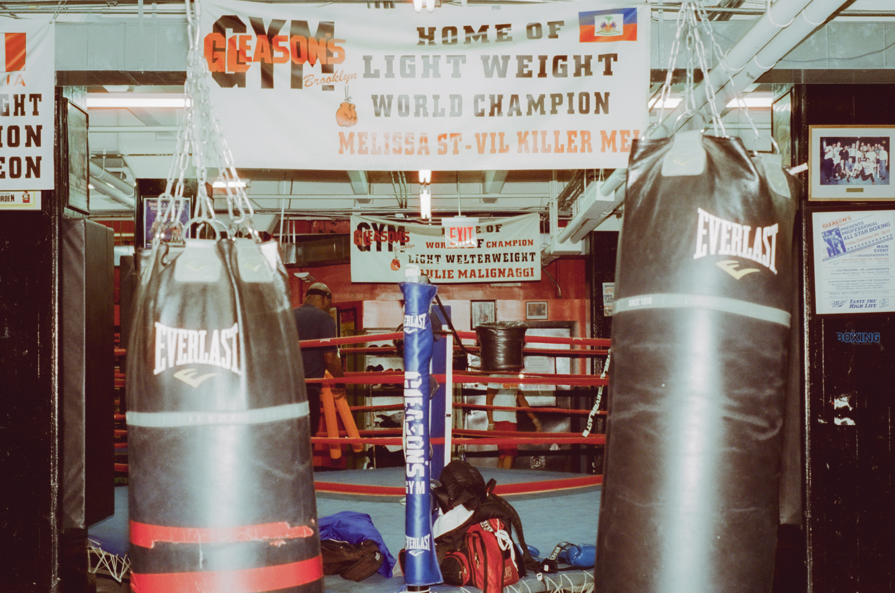
Situated in NYC’s Dumbo neighborhood right next to the Manhattan Bridge lies a nondescript boxing gym. Gleason’s Boxing Gym has been a long-standing fixture in the boxing community since 1937. The gym has developed beginners and sharpened the skills of professionals. Walking into Gleason’s is like walking into a Boxing history museum. The walls are decorated with title belts, photos, and equipment that go way back.
As a boxing fan, I wanted to visit the gym and get to see and feel the space that so many have before me. I wanted to document the gym and individuals that were training there. After talking to a few members and trainers I was able to get a closer look at a typical night at Gleason’s.
Creative Scope: Self-Initiated, Photography, Design, Animation
Year: 2022
Gleason’s Boxing Gym
I was sitting on a slew of photographs and videos from my night at the gym I decided to put together a quick video that combines my photography, video and some graphic elements inspired by the gym and sport. The result was video that incorporates the views and sounds of my night at the gym.

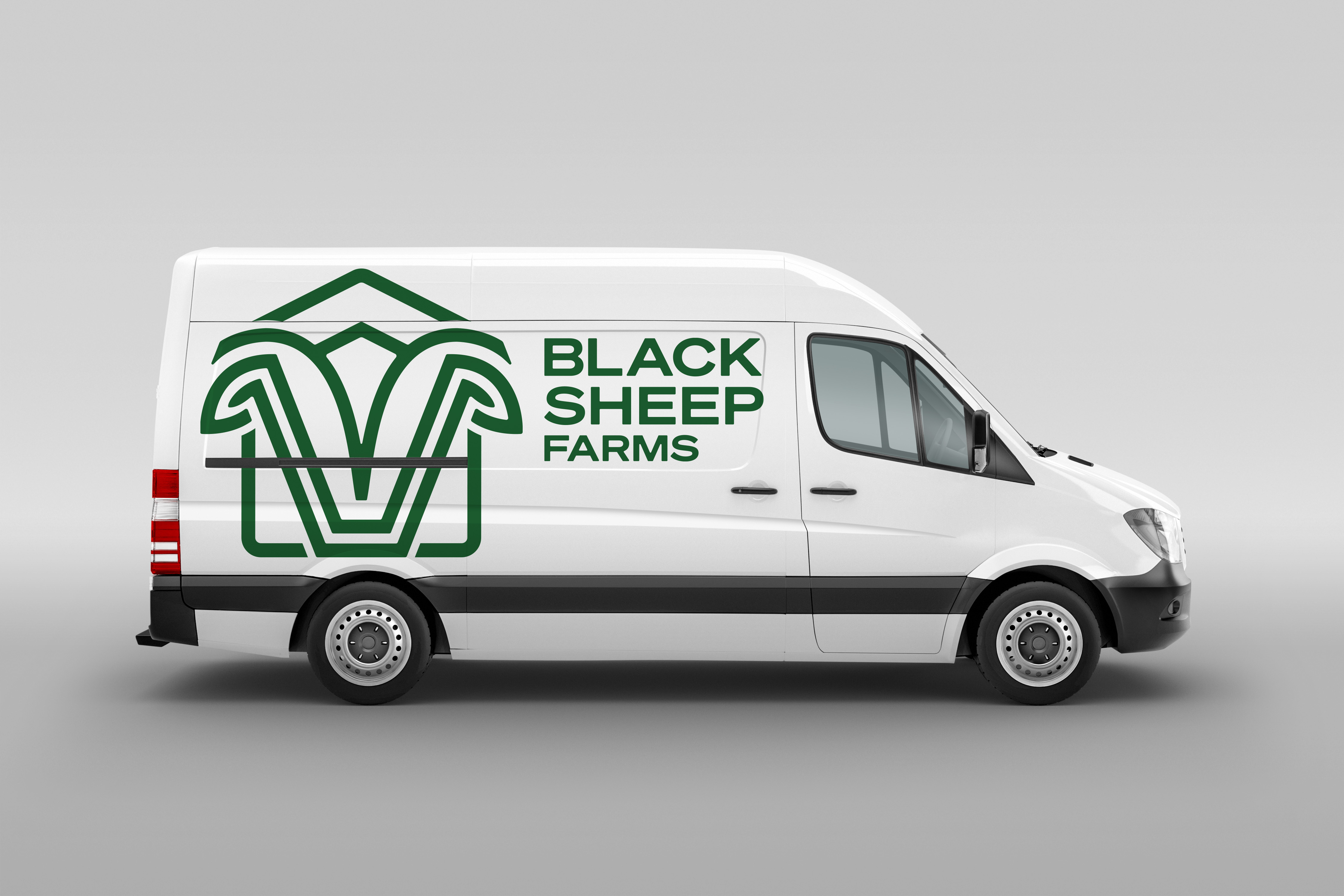
BLACK SHEEP FARMS BRAND IDENTITY
Black Sheep Farms (BSF) is a hydroponic farm based in Fort Meade, Florida, focusing on leafy greens and head lettuce. They’re one of 1.4% Minority Farms in the US that serves many clients, including public school systems, hospitals, and athletes from collegiate to professional levels.
Black Sheep Farm’s fully vertical business model, means the company handles every step of the process—from growing and harvesting to packaging and delivering its produce. The company’s mission extends beyond agriculture, with a clear goal of combating modern food deserts, starting in Polk and Highlands Counties and expanding beyond.
Creative Scope: Identity, Campaign work
Year: 2024-2025
Logo Design
The Black Sheep Farms logo is composed of two primary elements: the logomark and the wordmark. Together, these elements create a logo that reflects the core values of agriculture, innovation, and community that define Black Sheep Farms. The use of organic shapes and natural elements conveys a sense of trust and sustainability.
The green house shape symbolizes its Black Sheep Farm’s strong ties to agricultural roots. The inside mark resembles a sheep outline while also referring to a hole for the start of new growth. With ears that reference leaves to further emphasize the connection to nature. The upper lines emphasize the sheep’s horns while also including an arrow pointing upward to symbolize prosperity and new growth.


Branding Elements
Alongside the logo development, multiple mockups were created to align with practical usage and business needs. These mockups fall within the scope of Black Sheep Farms’ operations, showcasing the versatility and effectiveness of the brand mark.


Secondary Marks
Additional logos were created to serve as secondary marks. These designs combine the wordmark and logomark while incorporating elements significant to the brand’s history. Potential uses for these marks include t-shirt designs, packaging stamps, social media, and more.

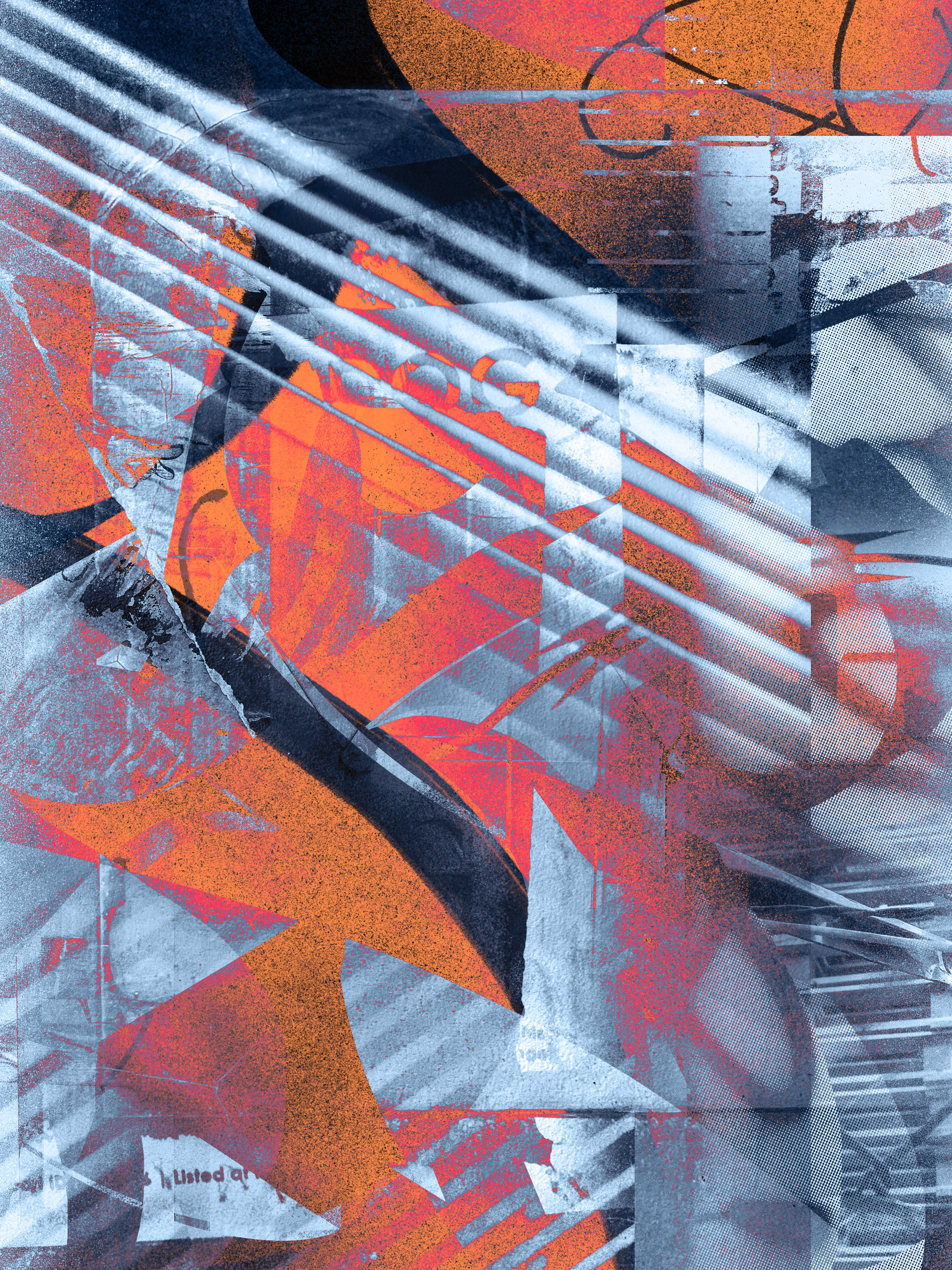
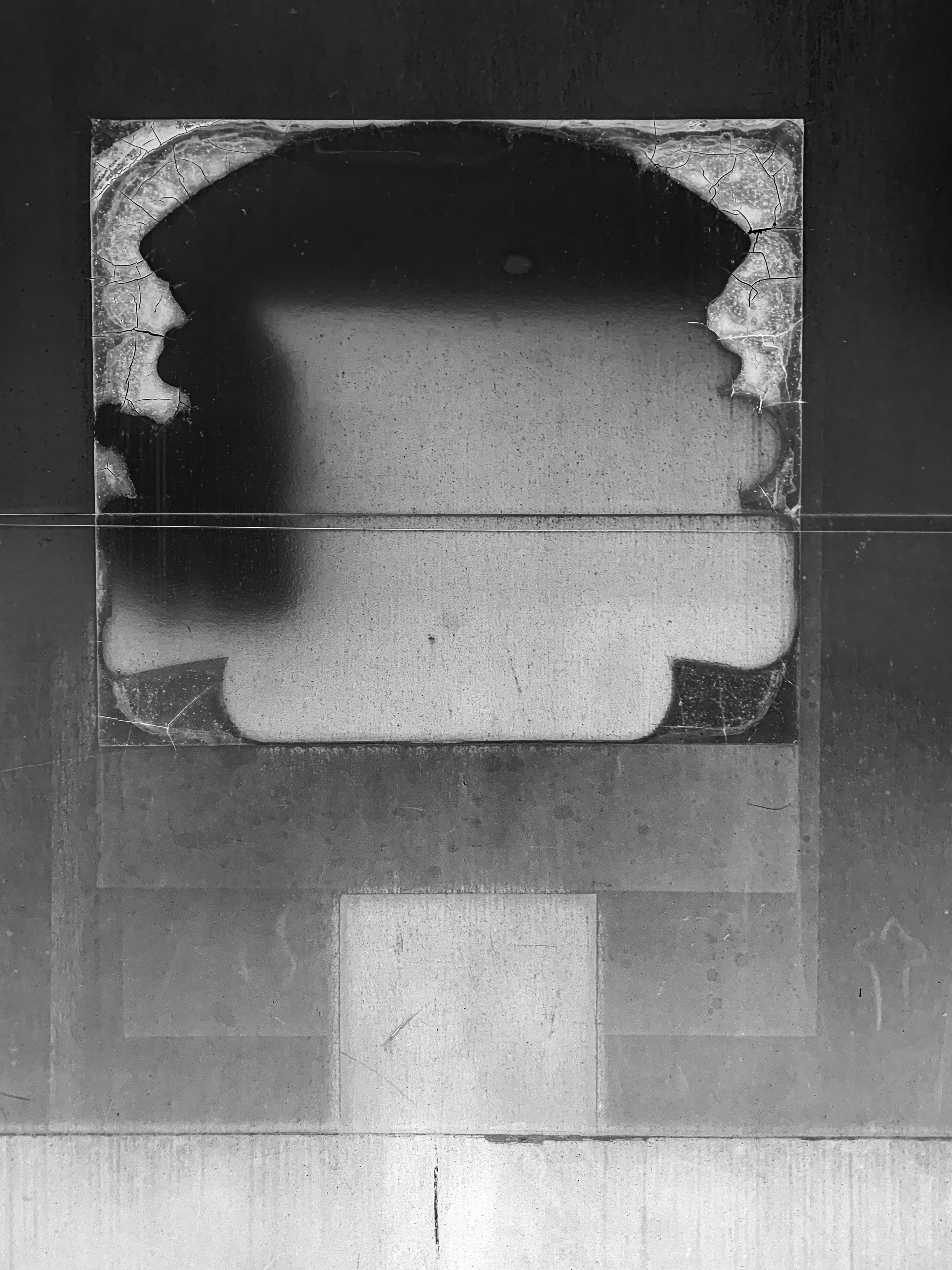
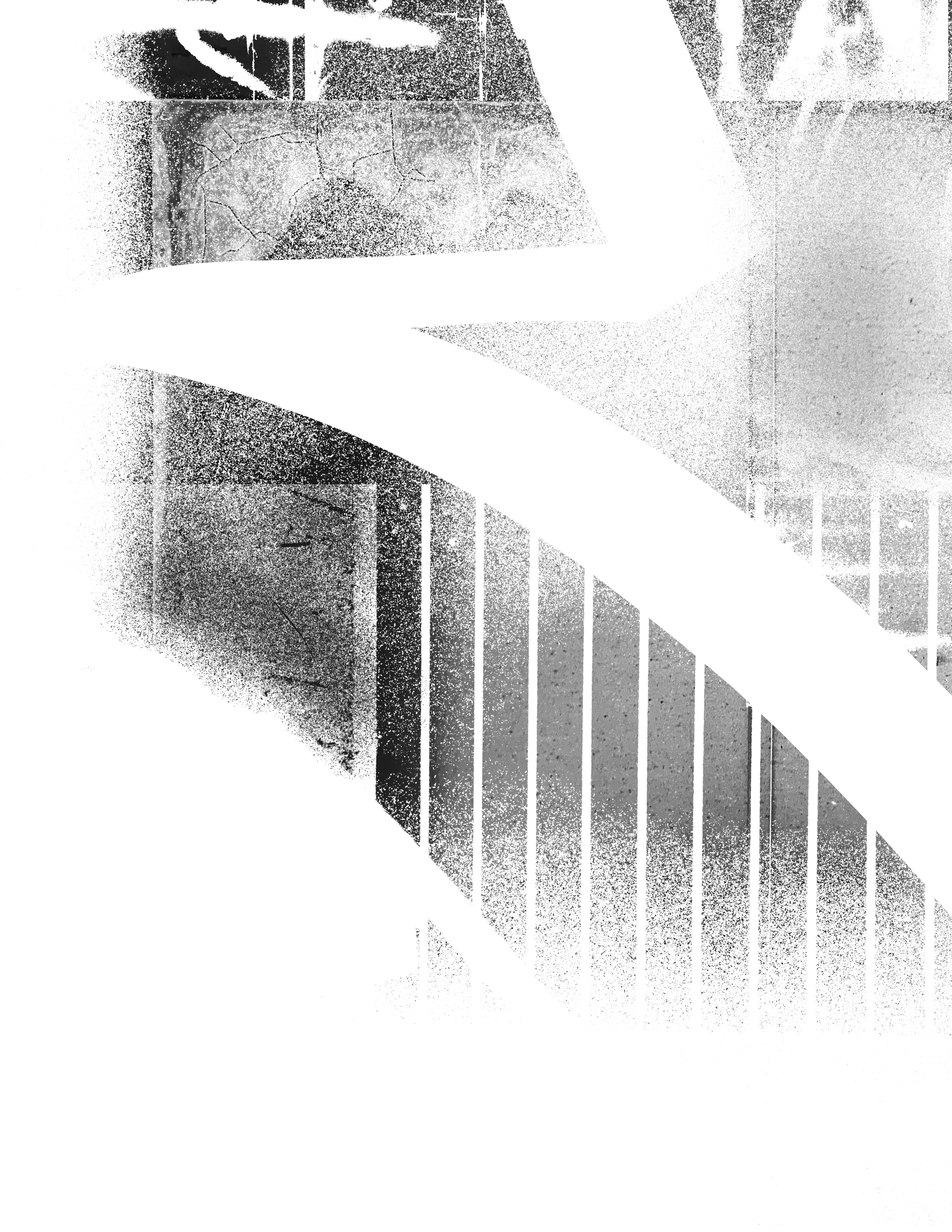
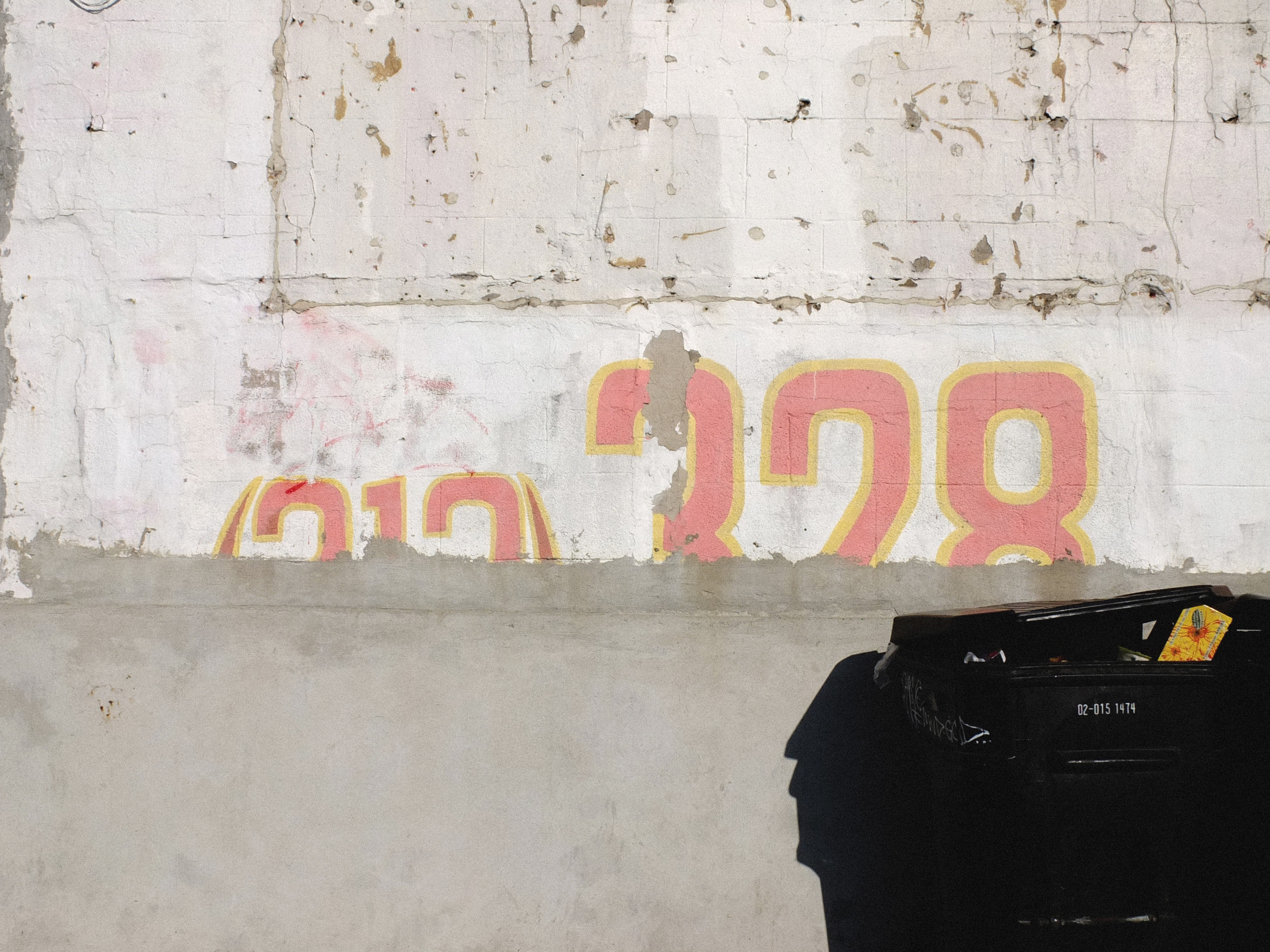
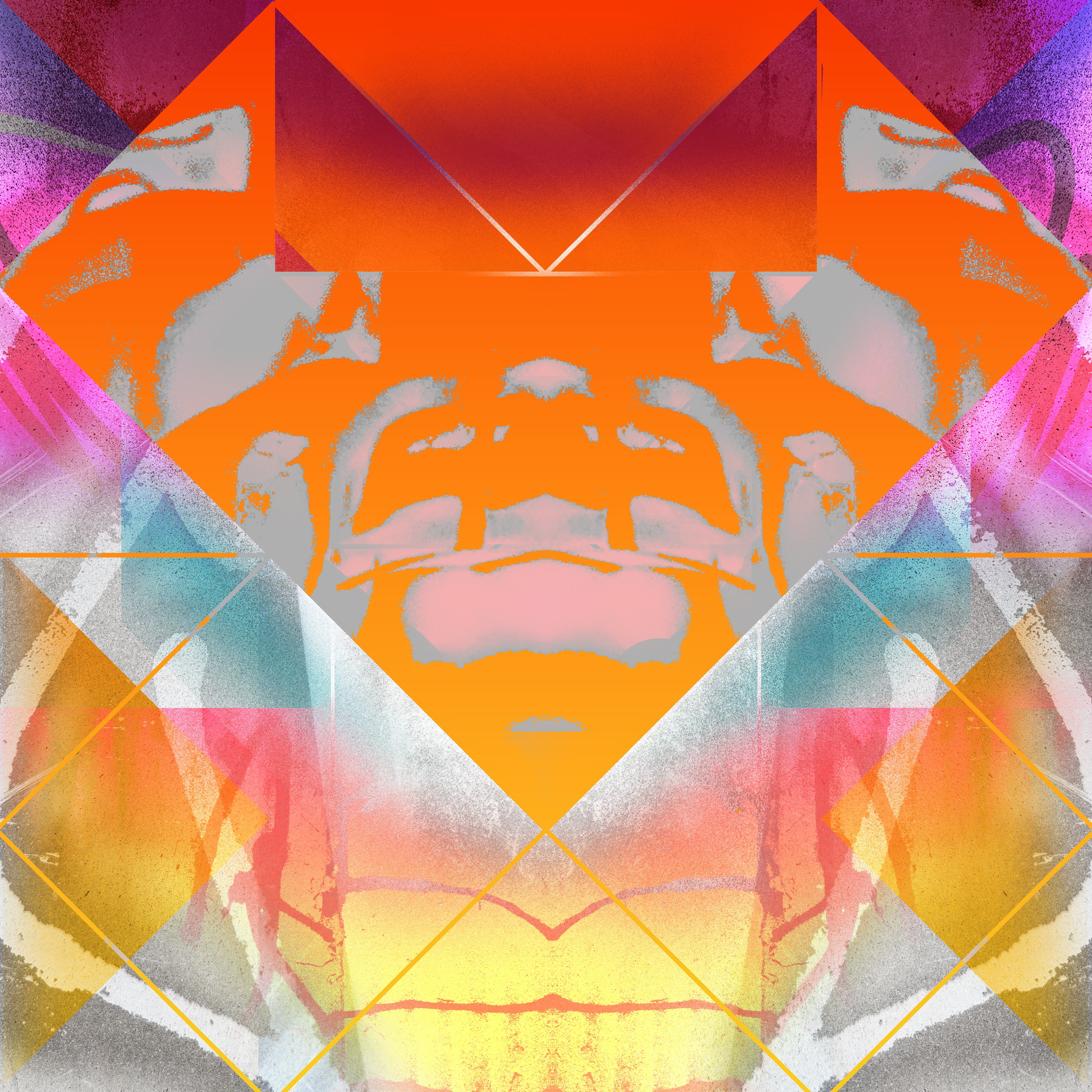
VISUAL NOISE
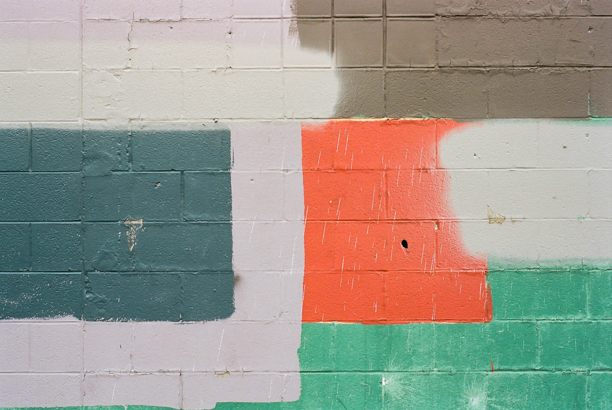
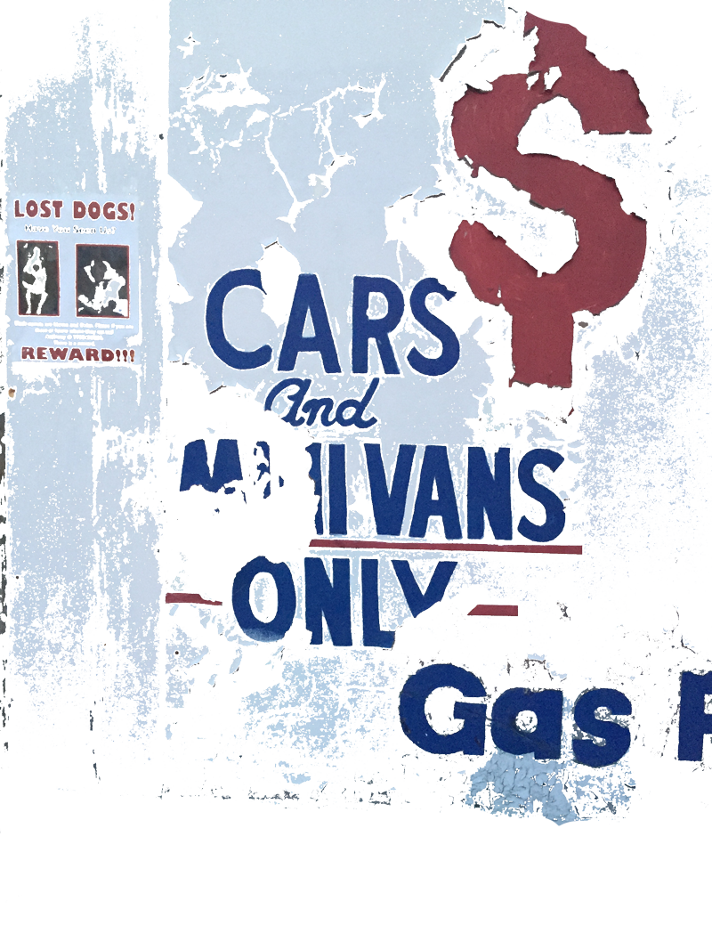
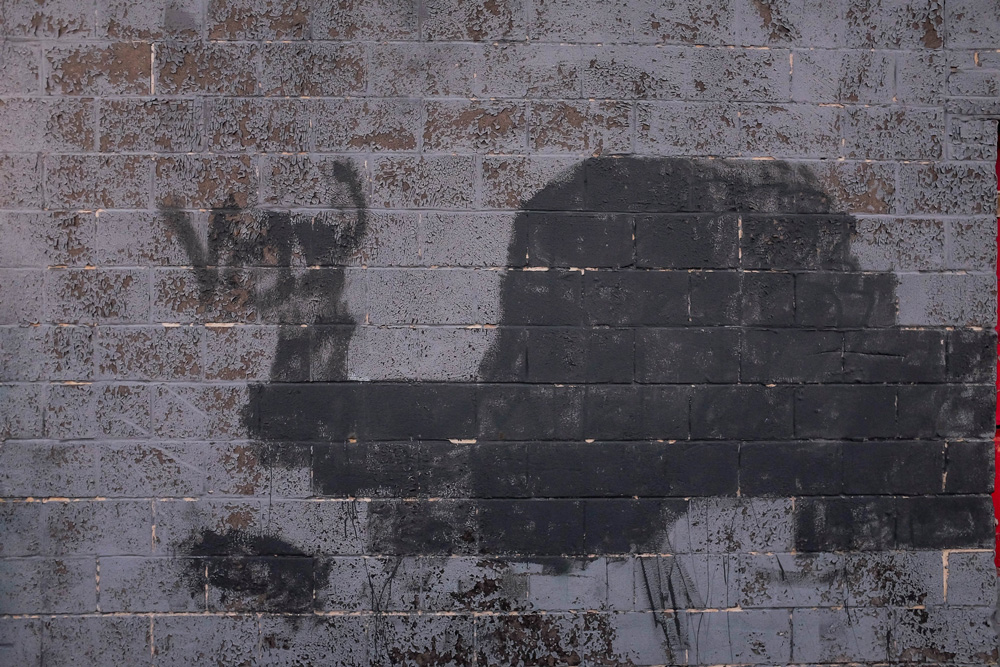
When I first redesigned my portfolio site, I imagined a space that functioned like a digital sketchbook—a living, breathing page inspired by the fluidity of Jack Kerouac’s scroll writing. I envisioned a single, continuous canvas that evolves as you scroll—where the top, middle, and bottom morph over time, never fixed, never finished.
Over the years, I’ve collected photographs of textures—quiet fragments of surfaces, light, and wear. I wanted to give them a home, a place where they could inspire new forms. This page is intentionally unpolished, loose in structure, and spontaneous in spirit. It holds design scraps, digital collages, short videos, motion experiments, and photography—pieces that don’t always belong elsewhere, but still speak.
It’s a space in progress. I’ll keep adding to it, letting it shift and grow organically—just like a sketchbook should.


JUST DAN NOW
PRODUCTIONS
Just Dan Now Productions is the creative moniker of Dan Kolodziej, a seasoned professional with a diverse background spanning feature films, short films, live remotes, production trucks, documentaries, in-studio programming, and broadcast news.
Seeking a visual identity that could unify and elevate his body of work, Dan envisioned a brand mark that reflected his deep appreciation for cinema—both classic and contemporary. The goal was to craft a logo that felt timeless: simple in form, yet instantly recognizable, capturing the essence of his storytelling across mediums.
Creative Scope: Branding, Identity, Animation, Print Design
Year: 2022

Behind the Design
Inspired by the vintage logos found on old VHS tapes and the iconic production company marks that once closed out film credits, the visual identity for Just Dan Now Productions draws heavily from the aesthetics of analog cinema. The J+D monogram emerged as the foundation—a clean, modern form infused with nostalgic character. To evoke the feeling of film being loaded into a reel, angular cuts were introduced into the letterforms, giving the monogram a sense of movement and mechanical rhythm. Subtle film strip perforations were also incorporated, grounding the mark in its cinematic heritage while maintaining a minimalist and timeless sensibility.

Color Palette
The color palette was intentionally kept minimal, relying on a grayscale range to ensure timelessness and versatility across all applications. This restrained palette not only complements the logo’s vintage inspiration but also draws directly from the tonal qualities of old film countdown leaders. The use of monochrome evokes a sense of classic cinema while allowing the identity to remain flexible across both digital and print environments.


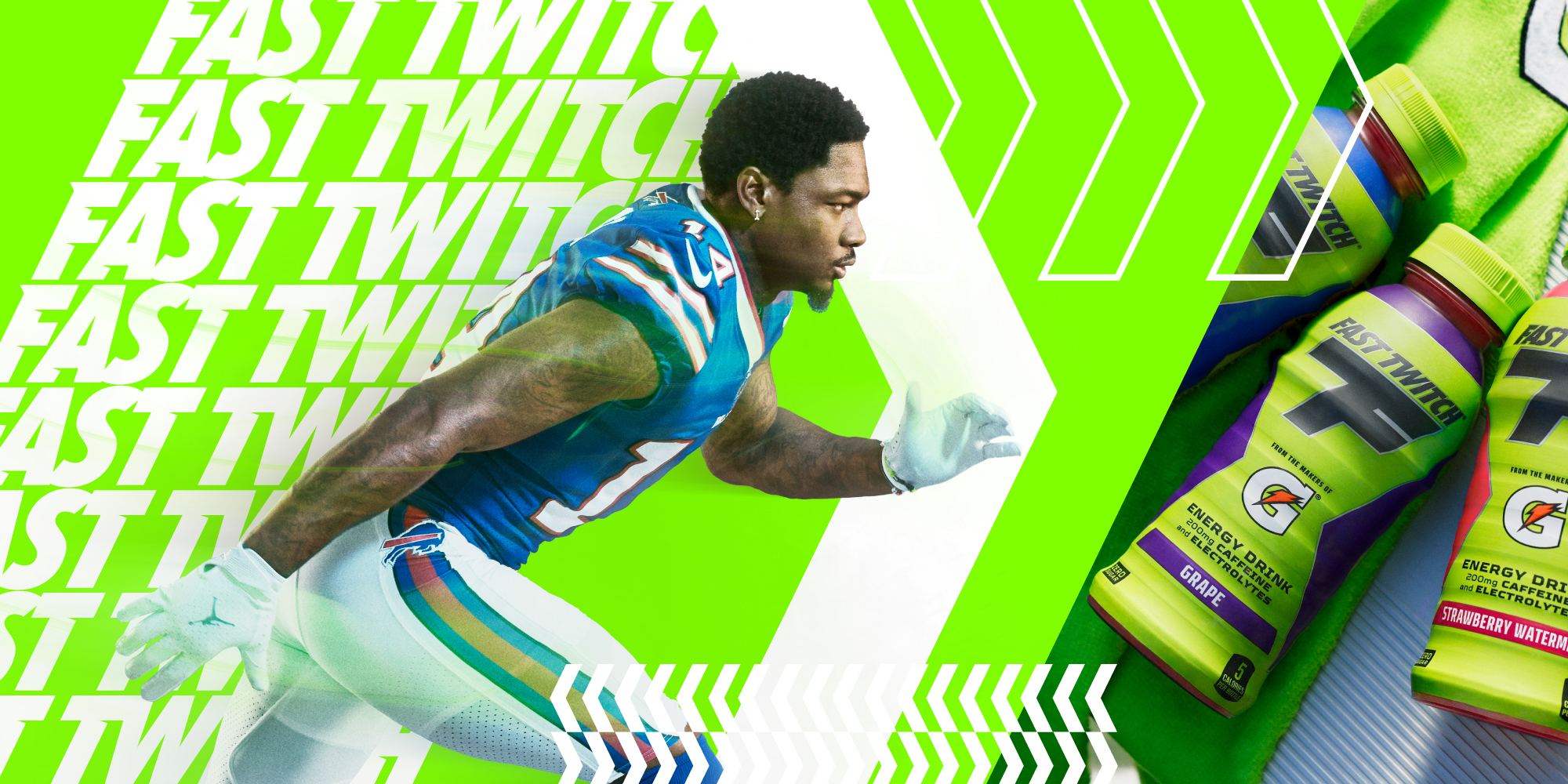
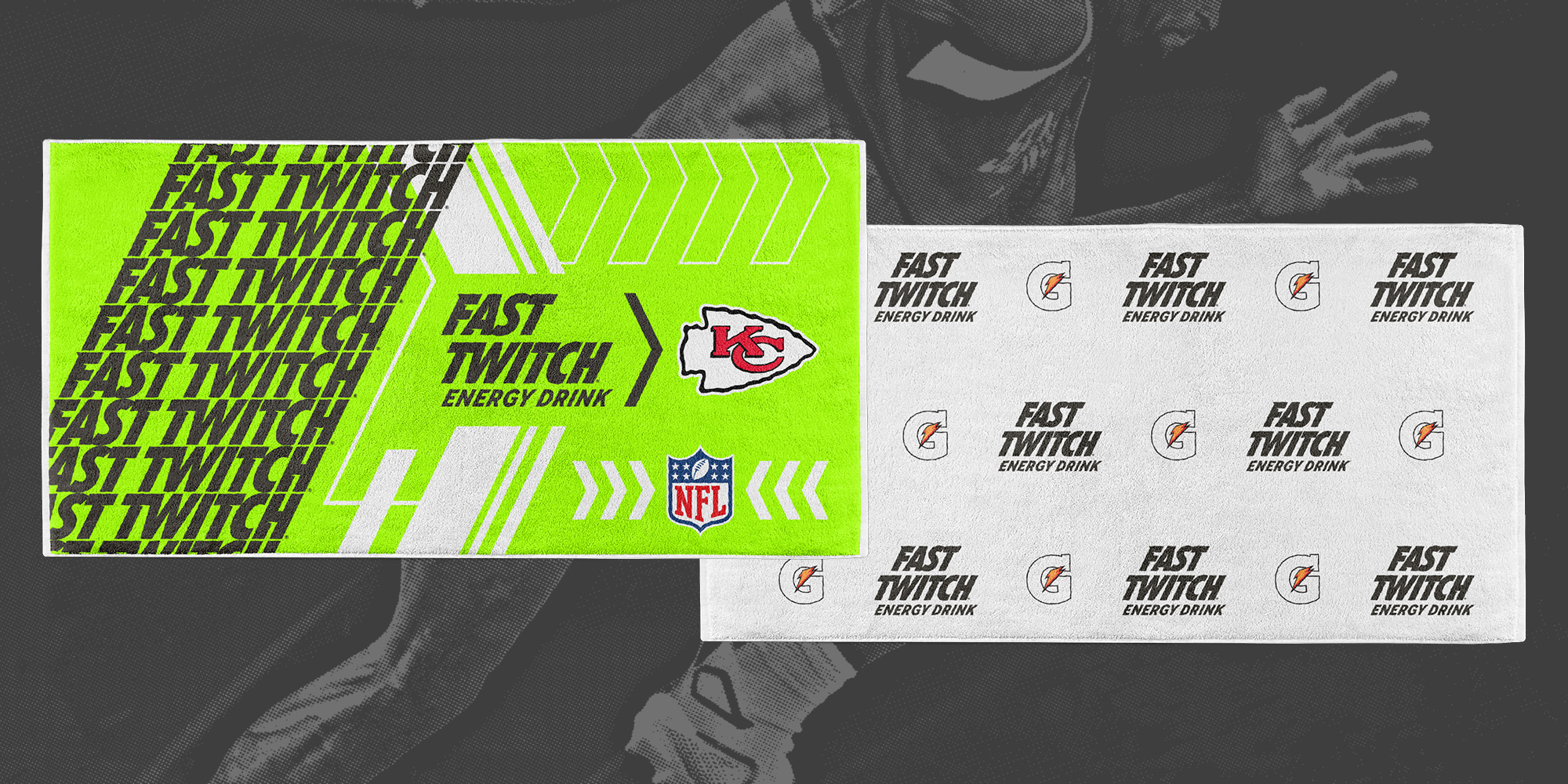
FAST TWITCH
ENERGY DRINK
Gatorade’s innovation extends far beyond hydration. With the launch of Fast Twitch—a new energy drink named after the high-performance muscle fibers responsible for explosive movement—the brand stepped into a bold new space. Engineered for intensity, Fast Twitch was designed to energize athletes before the first whistle, bridging science and sport in a way only Gatorade can.
The challenge: how do we translate this kinetic energy into a brand experience that resonates at retail, inspires on the field, and connects with consumers? The answer required a cohesive, multi-channel approach that infused the product’s explosive spirit into every touchpoint—from packaging and in-store presence to digital storytelling and athlete engagement.
The challenge: how do we translate this kinetic energy into a brand experience that resonates at retail, inspires on the field, and connects with consumers? The answer required a cohesive, multi-channel approach that infused the product’s explosive spirit into every touchpoint—from packaging and in-store presence to digital storytelling and athlete engagement.
Creative Scope: Identity, Packaging, Digital Assets, Environmental Graphics, Signage,
Year: 2022-2024
Design Direction: Lauren Versino
Year: 2022-2024
Design Direction: Lauren Versino

Brand Ideation
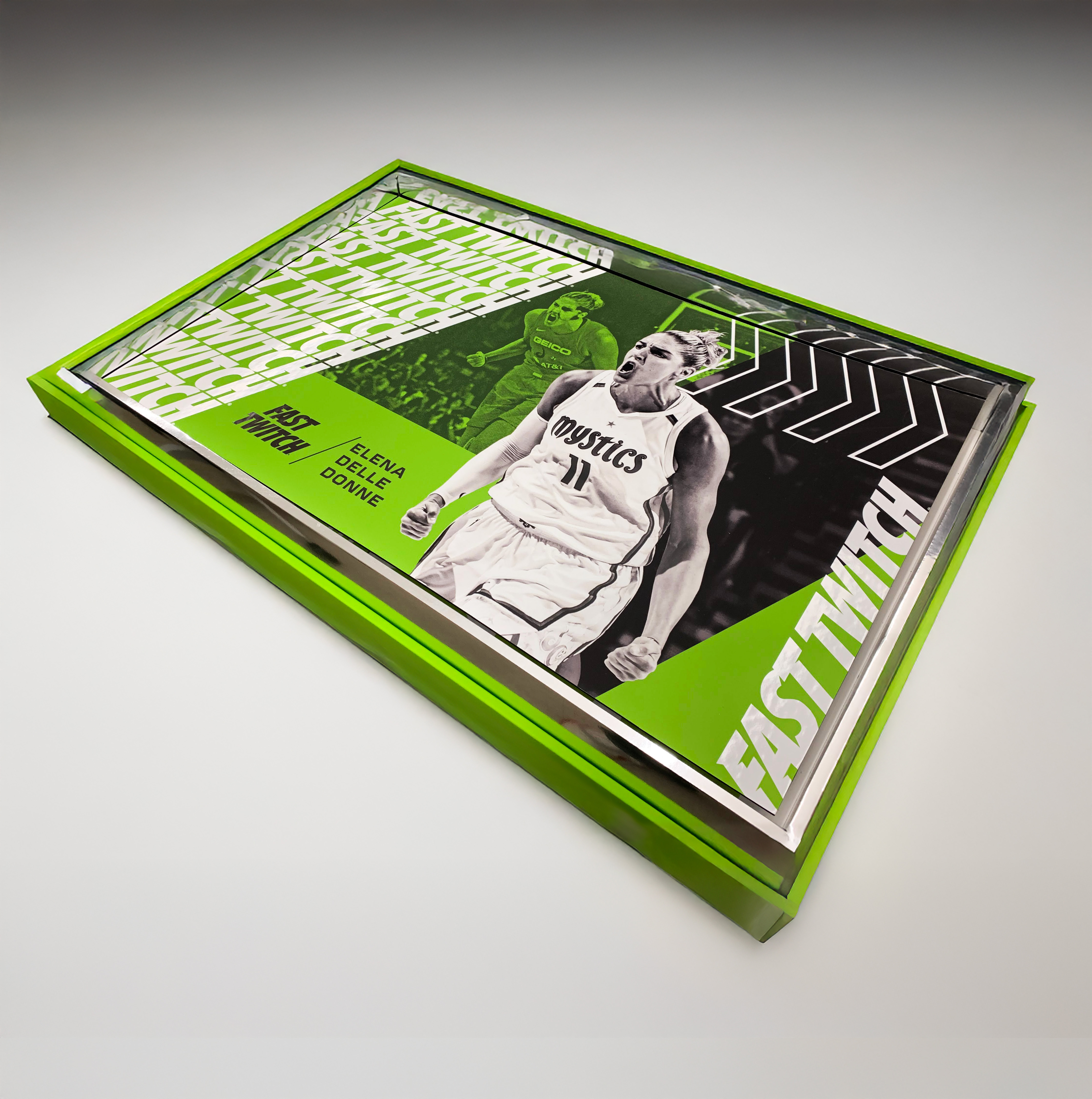
Our approach began at the point-of-sale, where visual impact is critical. At the core of the identity was Fast Twitch Energy Green—a vibrant, high-voltage hue crafted to command attention both in-store and on the field. Supporting graphic elements such as chevrons and directional arrows were integrated throughout the system to evoke speed, motion, and forward momentum—core attributes of the product itself.
A carefully considered color hierarchy played a key role across retail, print, and digital touchpoints. Initially, white functioned as the primary backdrop, accented by Fast Twitch Green and charcoal. However, through iterative design exploration, we discovered that inverting this hierarchy—elevating green and charcoal to dominate—better conveyed the brand’s bold energy and allowed the visual system to truly reflect the product’s high-intensity spirit across all mediums.
Visual System
This visual system was tested and applied across both vertical and horizontal formats, proving its adaptability across a wide range of mediums—from in-store point-of-sale displays to digital executions. To ensure brand consistency and visual cohesion, key layout elements were standardized across all applications. The headline, always set in Fast Twitch Green, remained the most dominant element and was consistently positioned in the top-left corner to anchor the composition. The product lockup—featuring the bottle—was centrally placed within a structured zone of Fast Twitch Green and white, creating a recognizable focal point that reinforced the brand's energy and visual identity across all touchpoints.

Visual System
To maintain visual clarity and flexibility across formats, the reason-to-believe messaging was strategically positioned based on orientation—appearing at the bottom in horizontal layouts and at the top in vertical executions. This adaptive placement preserved a consistent hierarchy and reinforced brand storytelling, while allowing each layout to function optimally within its format. The result: a cohesive system that balanced structure with adaptability across all design assets.

Brand Assets
Another key challenge was translating the established visual language into physical and environmental applications. While the in-store assets had a defined look and feel, bringing the brand to life in a larger, more immersive context required a bolder, more expressive approach. This opened the door to expanding the visual toolkit—leveraging chevrons, directional arrows, repeating logo patterns, and high-impact photography to amplify energy and movement. The result was a dynamic and cohesive brand presence that extended beyond retail, capturing the intensity and momentum of Fast Twitch in every physical touchpoint.